
Modern websites need to do more than just look good—they must function as efficient, user-centric platforms that convert visitors into customers. At DigiSwarm, we combine intelligent data with design thinking to elevate the digital experience. One of the most powerful tools we use is Heatmaps for UX and Conversion Optimisation, which visually represent how users interact with your site. These insights help uncover pain points and improve flow, leading to higher engagement and better results.
The ability to view real-time interaction patterns allows marketers and designers to detect what captures attention, what gets ignored, and where users hesitate. Whether it’s a landing page, product listing, or checkout screen, Heatmaps for UX and Conversion Optimisation transform raw data into intuitive visuals. At DigiSDwarm, we use these visuals to craft more strategic user experiences and eliminate guesswork in digital design.
For any business aiming to improve digital performance, using heatmaps is not just a technique—it’s a mindset. It reflects a commitment to understand user behaviour deeply, prioritise accessibility, and continuously optimise the customer journey for better conversion.
What Are Heatmaps and How Do They Work?
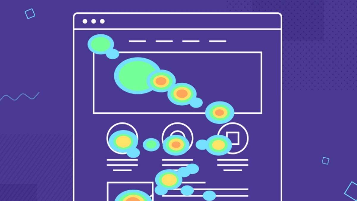
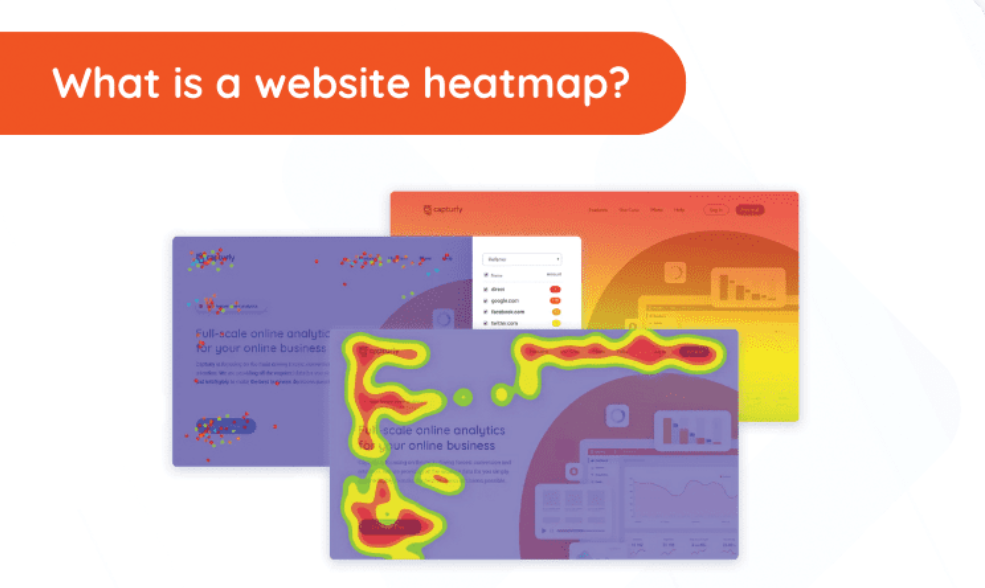
Heatmaps are graphical representations of user interactions on a webpage, using colours to denote frequency and intensity. Areas with high engagement are shown in warm colours (like red or orange), while less engaged areas appear in cooler shades (blue or green). These visuals make it easy to spot where users click, scroll, hover, or drop off.
There are different types of heatmaps, each offering distinct insights:
-
Click maps show which buttons, links, or images users are clicking.
-
Scroll maps reveal how far users scroll on a page, highlighting content visibility.
-
Mouse movement maps track where users hover their cursor, indicating attention.
-
Attention maps compile all interaction types to show zones of interest.
These tools are invaluable for marketers, designers, UX researchers, and developers alike. Heatmaps help identify disconnects between intent and design. For instance, if a large number of users click on a non-clickable element, it indicates miscommunication in design.
Heatmaps for UX and Conversion Optimisation: Why They Matter
User experience (UX) and conversion optimisation are two sides of the same coin. When a website feels intuitive, visitors are more likely to stay, explore, and convert. Heatmaps for UX and Conversion Optimisation make the invisible visible—they uncover design flaws, friction points, and behavioural patterns that analytics dashboards alone cannot provide.
Consider a landing page with a low conversion rate. Traditional analytics might show high bounce rates, but a heatmap can reveal why—perhaps the CTA is placed too low on the page, or a distracting element is drawing attention away. By addressing these issues, you not only improve the visual hierarchy but also boost engagement and sales.
Heatmaps also contribute to accessibility. If users with specific devices or screen sizes aren’t engaging with core elements, adjustments can be made. Furthermore, when used in A/B testing, heatmaps offer visual proof of performance differences between variants, making optimisation more precise.
Key Metrics You Can Improve Using Heatmaps
Using Heatmaps for UX and Conversion Optimisation can directly improve several core website metrics:
1. Bounce Rate: By understanding where users stop engaging, you can make pages stickier and encourage deeper interaction.
2. Session Duration: Heatmaps help reveal which areas keep users engaged. These can be leveraged or replicated Heatmaps for UX and Conversion Optimisation on other pages.
3. Click-Through Rate (CTR): Optimising the placement and design of links or buttons based on heatmap data improves CTR.
4. Form Completion Rate: If users abandon forms mid-way, heatmaps can show which fields are causing drop-offs or confusion.
5. Conversion Rate: Whether it’s signing up for a newsletter or making a purchase, heatmaps help you fine-tune each step of the funnel for better conversion.
A good example of this is shown in Crazy Egg’s case studies, where businesses increased conversions simply by relocating buttons or reducing distracting content based on heatmap findings.
Real-World Use Cases Across Industries
Almost every industry can benefit from using Heatmaps for UX and Conversion Optimisation, including:
E-commerce:
Retail websites use heatmaps to optimise product placement, filter usability, and checkout flows. If users aren’t clicking “Add to Cart,” a heatmap reveals whether it’s visibility or copy that’s to blame.
Education Platforms:
Online learning platforms use scroll maps to check whether Heatmaps for UX and Conversion Optimisation students reach important content or abandon midway. This helps restructure the content flow.
SaaS Companies:
Subscription services use attention heatmaps to test landing page variations and determine which headlines, features, or testimonials generate maximum interest.
News/Blog Sites:
Publishers use scroll maps to decide optimal ad placements and ensure that call-to-action boxes are within the user’s visual pathway.
At DigiSwarm, we integrate heatmaps with analytics dashboards to offer a complete performance overview. This combination allows us to drive strategic redesigns that are backed by both behavioural and statistical data.
Integrating Heatmaps into Your Marketing and Design Workflow
The success of Heatmaps for UX and Conversion Optimisation depends on how well they are embedded into your workflow. Here’s how we at DigiSwarm typically integrate heatmap data:
Audit and Baseline: Before changes are made, a heatmap is used to understand current engagement levels and user flow across key pages.
Hypothesis and A/B Testing: Heatmap findings guide hypotheses about what needs fixing. Changes are tested via A/B testing tools like Google Optimise.
Design Revisions: Designers use heatmaps to reposition elements, adjust layouts, or simplify navigation based on Heatmaps for UX and Conversion Optimisation interaction insights.
Performance Tracking: After implementation, new heatmaps are generated to assess whether user behaviour improved as expected.
Reporting: Monthly reports include heatmap snapshots alongside metric improvements to track long-term gains in user experience and conversion.
Challenges and Limitations of Heatmap Tools
While powerful, Heatmaps for UX and Conversion Optimisation aren’t without limitations. They offer surface-level visuals and need to be interpreted in the right context. Heatmaps don’t explain why a user dropped off, only where they did.
For comprehensive insight, heatmaps should be used alongside session replays, user testing, and form analytics. Additionally, mobile heatmaps can be less reliable due to finger gestures and scrolling behaviour that differs from desktop users.
Some tools may also slow down your website if not optimised properly. It’s important to choose high-performance, GDPR-compliant tools that protect user privacy.
Recommended Heatmap Tools for Businesses
Whether you’re a small business or a growing enterprise, there are tools suited to every level of complexity and budget:
-
Hotjar: Great for small to mid-sized websites with scroll, click, and user feedback options.
-
Crazy Egg: Offers A/B testing and snapshots for historical comparisons.
-
Microsoft Clarity: Free tool with heatmaps and session recordings.
-
Smartlook: Combines heatmaps with visitor recording and event tracking.
-
Lucky Orange: Offers a comprehensive suite with live chat, heatmaps, and analytics.
At DigiSwarm, we often recommend starting with Hotjar or Microsoft Clarity for initial insights and scaling up to more advanced tools as your UX strategy matures.
Conclusion: A Smarter Way to Design and Convert
In the data-driven world of digital marketing, the brands that listen to their users—and act on what they see—always outperform the rest. Heatmaps for UX and Conversion Optimisation offer marketers, designers, and strategists a powerful lens through which they can refine digital experiences and remove guesswork.
Whether you’re dealing with high bounce rates, unclear CTAs, or abandoned forms, heatmaps illuminate the user’s path. They answer the critical question: where are users actually paying attention on Heatmaps for UX and Conversion Optimisation .
At DigiSwarm, we believe that UX and conversion go hand in hand. That’s why we offer integrated CRO solutions backed by behavioural insights and real-time tracking. For businesses looking to work with the best digital marketing firm in Dehradun, we ensure your designs aren’t just beautiful—they’re purposeful and profitable.